A bit of signal processing swiftly reveals that diffusion models and autoregressive models aren’t all that different: diffusion models of images perform approximate autoregression in the frequency domain!
This blog post is also available as a Python notebook in Google Colab ![]() , with the code used to produce all the plots and animations.
, with the code used to produce all the plots and animations.
Last year, I wrote a blog post describing various different perspectives on diffusion. The idea was to highlight a number of connections between diffusion models and other classes of models and concepts. In recent months, I have given a few talks where I discussed some of these perspectives. My talk at the EEML 2024 summer school in Novi Sad, Serbia, was recorded and is available on YouTube. Based on the response I got from this talk, the link between diffusion models and autoregressive models seems to be particularly thought-provoking. That’s why I figured it could be useful to explore this a bit further.
In this blog post, I will unpack the above claim, and try to make it obvious that this is the case, at least for visual data. To make things more tangible, I decided to write this entire blog post in the form of a Python notebook (using Google Colab). That way, you can easily reproduce the plots and analyses yourself, and modify them to observe what happens. I hope this format will also help drive home the point that this connection between diffusion models and autoregressive models is “real”, and not just a theoretical idealisation that doesn’t hold up in practice.
In what follows, I will assume a basic understanding of diffusion models and the core concepts behind them. If you’ve watched the talk I linked above, you should be able to follow along. Alternatively, the perspectives on diffusion blog post should also suffice as preparatory reading. Some knowledge of the Fourier transform will also be helpful.
Below is an overview of the different sections of this post. Click to jump directly to a particular section.
- Two forms of iterative refinement
- A spectral view of diffusion
- What about sound?
- Unstable equilibrium
- Closing thoughts
- Acknowledgements
- References
Two forms of iterative refinement
Autoregression and diffusion are currently the two dominant generative modelling paradigms. There are many more ways to build generative models: flow-based models and adversarial models are just two possible alternatives (I discussed a few more in an earlier blog post).
Both autoregression and diffusion differ from most of these alternatives, by splitting up the difficult task of generating data from complex distributions into smaller subtasks that are easier to learn. Autoregression does this by casting the data to be modelled into the shape of a sequence, and recursively predicting one sequence element at a time. Diffusion instead works by defining a corruption process that gradually destroys all structure in the data, and training a model to learn to invert this process step by step.
This iterative refinement approach to generative modelling is very powerful, because it allows us to construct very deep computational graphs for generation, without having to backpropagate through them during training. Indeed, both autoregressive models and diffusion models learn to perform a single step of refinement at a time – the generative process is not trained end-to-end. It is only when we try to sample from the model that we connect all these steps together, by sequentially performing the subtasks: predicting one sequence element after another in the case of autoregression, or gradually denoising the input step-by-step in the case of diffusion.
Because this underlying iterative approach is common to both paradigms, people have often sought to connect the two. One could frame autoregression as a special case of discrete diffusion, for example, with a corruption process that gradually replaces tokens by “mask tokens” from right to left, eventually ending up with a fully masked sequence. In the next few sections, we will do the opposite, framing diffusion as a special case of autoregression, albeit approximate.
Today, most language models are autoregressive, while most models of images and video are diffusion-based. In many other application domains (e.g. protein design, planning in reinforcement learning, …), diffusion models are also becoming more prevalent. I think this dichotomy, which can be summarised as “autoregression for language, and diffusion for everything else”, is quite interesting. I have written about it before, and I will have more to say about it in a later section of this post.
A spectral view of diffusion
Image spectra
When diffusion models rose to prominence for image generation, people noticed quite quickly that they tend to produce images in a coarse-to-fine manner. The large-scale structure present in the image seems to be decided in earlier denoising steps, whereas later denoising steps add more and more fine-grained details.
To formalise this observation, we can use signal processing, and more specifically spectral analysis. By decomposing an image into its constituent spatial frequency components, we can more precisely tease apart its coarse- and fine-grained structure, which correspond to low and high frequencies respectively.
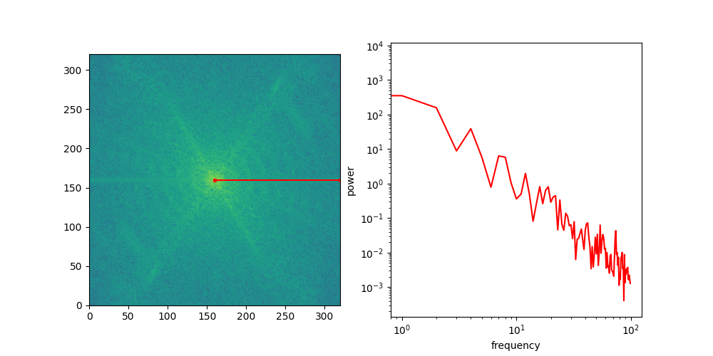
We can use the 2D Fourier transform to obtain a frequency representation of an image. This representation is invertible, i.e. it contains the same information as the pixel representation – it is just organised in a different way. Like the pixel representation, it is a 2D grid-structured object, with the same width and height as the original image, but the axes now correspond to horizontal and vertical spatial frequencies, rather than spatial positions.
To see what this looks like, let’s take some images and visualise their spectra.
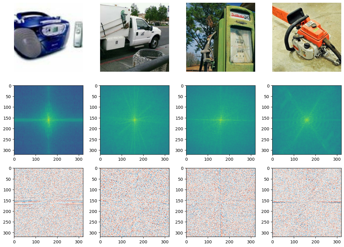
Shown above on the first row are four images from the Imagenette dataset, a subset of the ImageNet dataset (I picked it because it is relatively fast to load).
The Fourier transform is typically complex-valued, so the next two rows visualise the magnitude and the phase of the spectrum respectively. Because the magnitude varies greatly across different frequencies, its logarithm is shown. The phase is an angle, which varies between \(-\pi\) and \(\pi\). Note that we only calculate the spectrum for the green colour channel – we could calculate it for the other two channels as well, but they would look very similar.
The centre of the spectrum corresponds to the lowest spatial frequencies, and the frequencies increase as we move outward to the edges. This allows us to see where most of the energy in the input signal is concentrated. Note that by default, it is the other way around (low frequencies in the corner, high frequencies in the middle), but np.fft.fftshift allows us to swap these, which yields a much nicer looking visualisation that makes the structure of the spectrum more apparent.
A lot of interesting things can be said about the phase structure of natural images, but in what follows, we will primarily focus on the magnitude spectrum. The square of the magnitude is the power, so in practice we often look at the power spectrum instead. Note that the logarithm of the power spectrum is simply that of the magnitude spectrum, multiplied by two.
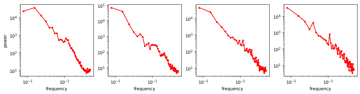
Looking at the spectra, we now have a more formal way to reason about different feature scales in images, but that still doesn’t explain why diffusion models exhibit this coarse-to-fine behaviour. To see why this happens, we need to examine what a typical image spectrum looks like. To do this, we will make abstraction of the directional nature of frequencies in 2D space, simply by slicing the spectrum along a certain angle, rotating that slice all around, and then averaging the slices across all rotations. This yields a one-dimensional curve: the radially averaged power spectral density, or RAPSD.
Below is an animation that shows individual directional slices of the 2D spectrum on a log-log plot, which are averaged to obtain the RAPSD.
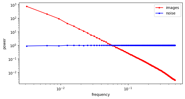
Let’s see what that looks like for the four images above. We will use the pysteps library, which comes with a handy function to calculate the RAPSD in one go.
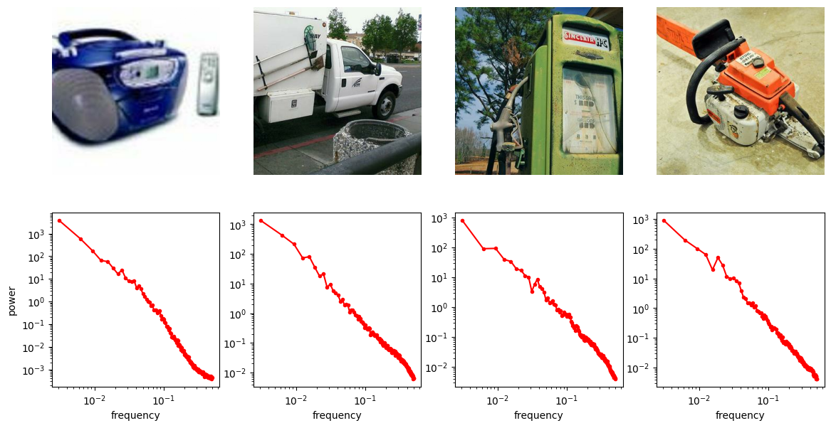
The RAPSD is best visualised on a log-log plot, to account for the large variation in scale. We chop off the so-called DC component (with frequency 0) to avoid taking the logarithm of 0.
Another thing this visualisation makes apparent is that the curves are remarkably close to being straight lines. A straight line on a log-log plot implies that there might be a power law lurking behind all of this.
Indeed, this turns out to be the case: natural image spectra tend to approximately follow a power law, which means that the power \(P(f)\) of a particular frequency \(f\) is proportional to \(f^{-\alpha}\), where \(\alpha\) is a parameter1 2 3. In practice, \(\alpha\) is often remarkably close to 2 (which corresponds to the spectrum of pink noise in two dimensions).
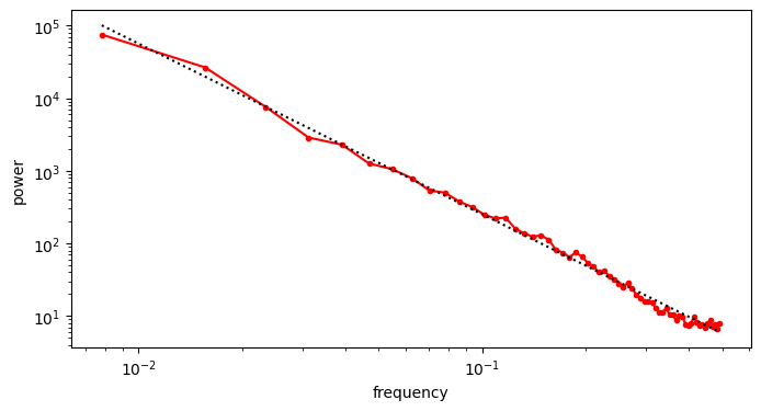
We can get closer to the “typical” RAPSD by taking the average across a bunch of images (in the log-domain).
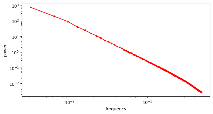
As I’m sure you will agree, that is pretty unequivocally a power law!
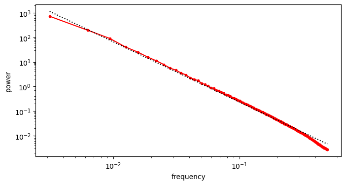
To estimate the exponent \(\alpha\), we can simply use linear regression in log-log space. Before proceeding however, it is useful to resample our averaged RAPSD so the sample points are linearly spaced in log-log space – otherwise our fit will be dominated by the high frequencies, where we have many more sample points.
We obtain an estimate \(\hat{\alpha} = 2.454\), which is a bit higher than the typical value of 2. As far as I understand, this can be explained by the presence of man-made objects in many of the images we used, because they tend to have smooth surfaces and straight angles, which results in comparatively more low-frequency content and less high-frequency content compared to images of nature. Let’s see what our fit looks like.
Noisy image spectra
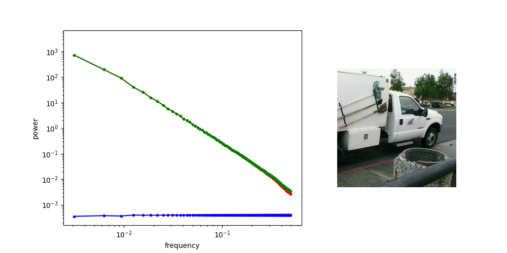
A crucial aspect of diffusion models is the corruption process, which involves adding Gaussian noise. Let’s see what this does to the spectrum. The first question to ask is: what does the spectrum of noise look like? We can repeat the previous procedure, but replace the image input with standard Gaussian noise. For contrast, we will visualise the spectrum of the noise alongside that of the images from before.
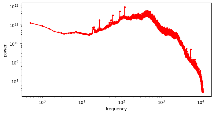
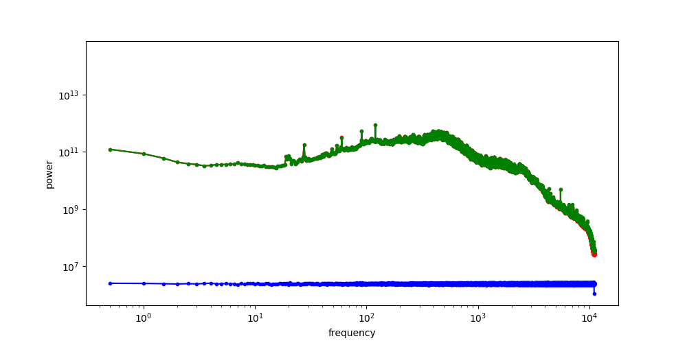
The RAPSD of Gaussian noise is also a straight line on a log-log plot; but a horizontal one, rather than one that slopes down. This reflects the fact that Gaussian noise contains all frequencies in equal measure. The Fourier transform of Gaussian noise is itself Gaussian noise, so its power must be equal across all frequencies in expectation.
When we add noise to the images and look at the spectrum of the resulting noisy images, we see a hinge shape:
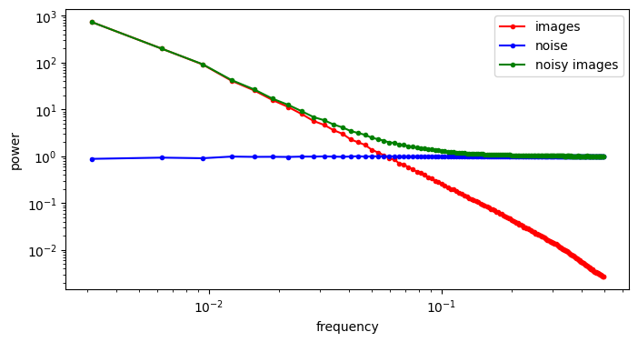
Why does this happen? Recall that the Fourier transform is linear: the Fourier transform of the sum of two things, is the sum of the Fourier transforms of those things. Because the power of the different frequencies varies across orders of magnitude, one of the terms in this sum tends to drown out the other. This is what happens at low frequencies, where the image spectrum dominates, and hence the green curve overlaps with the red curve. At high frequencies on the other hand, the noise spectrum dominates, and the green curve overlaps with the blue curve. In between, there is a transition zone where the power of both spectra is roughly matched.
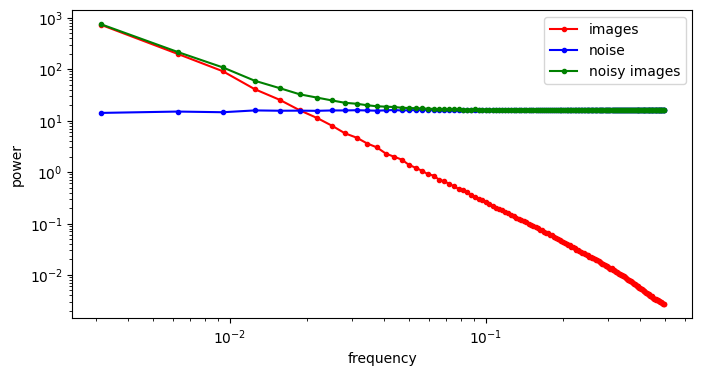
If we increase the variance of the noise by scaling the noise term, we increase its power, and as a result, its RAPSD will shift upward (which is also a consequence of the linearity of the Fourier transform). This means a smaller part of the image spectrum now juts out above the waterline: the increasing power of the noise looks like the rising tide!
At this point, I’d like to revisit a diagram from the perspectives on diffusion blog post, where I originally drew the connection between diffusion and autoregression in frequency space, which is shown below.
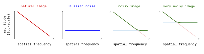
These idealised plots of the spectra of images, noise, and their superposition match up pretty well with the real versions. When I originally drew this, I didn’t actually realise just how closely this reflects reality!
What these plots reveal is an approximate equivalence (in expectation) between adding noise to images, and low-pass filtering them. The noise will drown out some portion of the high frequencies, and leave the low frequencies untouched. The variance of the noise determines the cut-off frequency of the filter. Note that this is the case only because of the characteristic shape of natural image spectra.
The animation below shows how the spectrum changes as we gradually add more noise, until it eventually overpowers all frequency components, and all image content is gone.
Diffusion
With this in mind, it becomes apparent that the corruption process used in diffusion models is actually gradually filtering out more and more high-frequency information from the input image, and the different time steps of the process correspond to a frequency decomposition: basically an approximate version of the Fourier transform!
Since diffusion models themselves are tasked with reversing this corruption process step-by-step, they end up roughly predicting the next higher frequency component at each step of the generative process, given all preceding (lower) frequency components. This is a soft version of autoregression in frequency space, or if you want to make it sound fancier, approximate spectral autoregression.
To the best of my knowledge, Rissanen et al. (2022)4 were the first to apply this kind of analysis to diffusion in the context of generative modelling (see §2.2 in the paper). Their work directly inspired this blog post.
In many popular formulations of diffusion, the corruption process does not just involve adding noise, but also rescaling the input to keep the total variance within a reasonable range (or constant, in the case of variance-preserving diffusion). I have largely ignored this so far, because it doesn’t materially change anything about the intuitive interpretation. Scaling the input simply results in the RAPSD shifting up or down a bit.
Which frequencies are modelled at which noise levels?
There seems to be a monotonic relationship between noise levels and spatial frequencies (and hence feature scales). Can we characterise this quantitatively?
We can try, but it is important to emphasise that this relationship is only really valid in expectation, averaged across many images: for individual images, the spectrum will not be a perfectly straight line, and it will not typically be monotonically decreasing.
Even if we ignore all that, the “elbow” of the hinge-shaped spectrum of a noisy image is not very sharp, so it is clear that there is quite a large transition zone where we cannot unequivocally say that a particular frequency is dominated by either signal or noise. So this is, at best, a very smooth approximation to the “hard” autoregression used in e.g. large language models.
Keeping all of that in mind, let us construct a mapping from noise levels to frequencies for a particular diffusion process and a particular image distribution, by choosing a signal-to-noise ratio (SNR) threshold, below which we will consider the signal to be undetectable. This choice is quite arbitrary, and we will just have to choose a value and stick with it. We can choose 1 to keep things simple, which means that we consider the signal to be detectable if its power is equal to or greater than the power of the noise.
Consider a Gaussian diffusion process for which \(\mathbf{x}_t = \alpha(t)\mathbf{x}_0 + \sigma(t) \mathbf{\varepsilon}\), with \(\mathbf{x}_0\) an example from the data distribution, and \(\mathbf{\varepsilon}\) standard Gaussian noise.
Let us define \(\mathcal{R}[\mathbf{x}](f)\) as the RAPSD of an image \(\mathbf{x}\) evaluated at frequency \(f\). We will call the SNR threshold \(\tau\). If we consider a particular time step \(t\), then assuming the RAPSD is monotonically decreasing, we can define the maximal detectable frequency \(f_\max\) at this time step in the process as the maximal value of \(f\) for which:
\[\mathcal{R}[\alpha(t)\mathbf{x}_0](f) > \tau \cdot \mathcal{R}[\sigma(t)\mathbf{\varepsilon}](f).\]Recall that the Fourier transform is a linear operator, and \(\mathcal{R}\) is a radial average of the square of its magnitude. Therefore, scaling the input to \(\mathcal{R}\) by a real value means the output gets scaled by its square. We can use this to simplify things:
\[\mathcal{R}[\mathbf{x}_0](f) > \tau \cdot \frac{\sigma(t)^2}{\alpha(t)^2} \mathcal{R}[\mathbf{\varepsilon}](f).\]We can further simplify this by noting that \(\forall f: \mathcal{R}[\mathbf{\varepsilon}](f) = 1\):
\[\mathcal{R}[\mathbf{x}_0](f) > \tau \cdot \frac{\sigma(t)^2}{\alpha(t)^2}.\]To construct such a mapping in practice, we first have to choose a diffusion process, which gives us the functional form of \(\sigma(t)\) and \(\alpha(t)\). To keep things simple, we can use the rectified flow5 / flow matching6 process, as used in Stable Diffusion 37, for which \(\sigma(t) = t\) and \(\alpha(t) = 1 - t\). Combined with \(\tau = 1\), this yields:
\[\mathcal{R}[\mathbf{x}_0](f) > \left(\frac{t}{1 - t}\right)^2.\]With these choices, we can now determine the shape of \(f_\max(t)\) and visualise it.
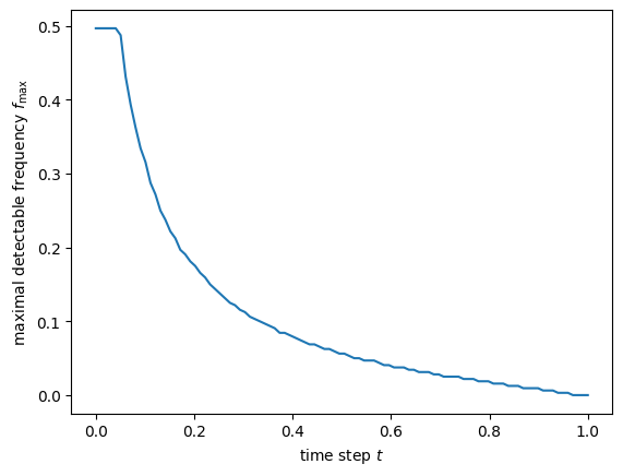
The frequencies here are relative: if the bandwidth of the signal is 1, then 0.5 corresponds to the Nyquist frequency, i.e. the maximal frequency that is representable with the given bandwidth.
Note that all representable frequencies are detectable at time steps near 0. As \(t\) increases, so does the noise level, and hence \(f_\max\) starts dropping, until it eventually reaches 0 (no detectable signal frequencies are left) close to \(t = 1\).
What about sound?
All of the analysis above hinges on the fact that spectra of natural images typically follow a power law. Diffusion models have also been used to generate audio8 9, which is the other main perceptual modality besides the visual. A very natural question to ask is whether the same interpretation makes sense in the audio domain as well.
To establish that, we will grab a dataset of typical audio recordings that we might want to build a generative model of: speech and music.
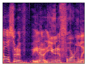
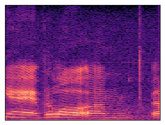
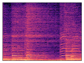
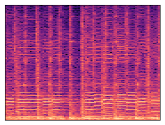
Along with each audio player, a spectrogram is shown: this is a time-frequency representation of the sound, which is obtained by applying the Fourier transform to short overlapping windows of the waveform and stacking the resulting magnitude vectors together in a 2D matrix.
For the purpose of comparing the spectrum of sound with that of images, we will use the 1-dimensional analogue of the RAPSD, which is simply the squared magnitude of the 1D Fourier transform.
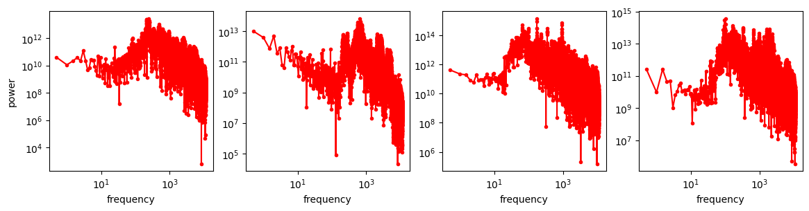
These are a lot noisier than the image spectra, which is not surprising as these are not averaged over directions, like the RAPSD is. But aside from that, they don’t really look like straight lines either – the power law shape is nowhere to be seen!
I won’t speculate about why images exhibit this behaviour and sound seemingly doesn’t, but it is certainly interesting (feel free to speculate away in the comments!). To get a cleaner view, we can again average the spectra of many clips in the log domain, as we did with the RAPSDs of images.
Definitely not a power law. More importantly, it is not monotonic, so adding progressively more Gaussian noise to this does not obfuscate frequencies in descending order: the “diffusion is just spectral autoregression” meme does not apply to audio waveforms!
The average spectrum of our dataset exhibits a peak around 300-400 Hz. This is not too far off the typical spectrum of green noise, which has more energy in the region of 500 Hz. Green noise is supposed to sound like “the background noise of the world”.
As the animation above shows, the different frequencies present in audio signals still get filtered out gradually from least powerful to most powerful, because the spectrum of Gaussian noise is still flat, just like in the image domain. But as the audio spectrum does not monotonically decay with increasing frequency, the order is not monotonic in terms of the frequencies themselves.
What does this mean for diffusion in the waveform domain? That’s not entirely clear to me. It certainly makes the link with autoregressive models weaker, but I’m not sure if there are any negative implications for generative modelling performance.
One observation that does perhaps indicate that this is the case, is that a lot of diffusion models of audio described in the literature do not operate directly in the waveform domain. It is quite common to first extract some form of spectrogram (as we did earlier), and perform diffusion in that space, essentially treating it like an image10 11 12. Note that spectrograms are a somewhat lossy representation of sound, because phase information is typically discarded.
To understand the implications of this for diffusion models, we will extract log-scaled mel-spectrograms from the sound clips we have used before. The mel scale is a nonlinear frequency scale which is intended to be perceptually uniform, and which is very commonly used in spectral analysis of sound.
Next, we will interpret these spectrograms as images and look at their spectra. Taking the spectrum of a spectrum might seem odd – some of you might even suggest that it is pointless, because the Fourier transform is its own inverse! But note that there are a few nonlinear operations happening in between: taking the magnitude (discarding the phase information), mel-binning and log-scaling. As a result, this second Fourier transform doesn’t just undo the first one.
It seems like the power law has resurfaced! We can look at the average in the log-domain again to get a smoother curve.
I found this pretty surprising. I actually used to object quite strongly to the idea of treating spectrograms as images, as in this tweet in response to Riffusion, a variant of Stable Diffusion finetuned on spectrograms:
Me: "NOOO, you can't just treat spectrograms as images, the frequency and time axes have completely different semantics, there is no locality in frequency and ..."
— Sander Dieleman (@sedielem) December 15, 2022
These guys: "Stable diffusion go brrr" https://t.co/Akv8aZl8Rv
… but I have always had to concede that it seems to work pretty well in practice, and perhaps the fact that spectrograms exhibit power-law spectra is one reason why.
There is also an interesting link with mel-frequency cepstral coefficients (MFCCs), a popular feature representation for speech and music processing which predates the advent of deep learning. These features are constructed by taking the discrete cosine transform (DCT) of a mel-spectrogram. The resulting spectrum-of-a-spectrum is often referred to as the cepstrum.
So with this approach, perhaps the meme applies to sound after all, albeit with a slight adjustment: diffusion on spectrograms is just cepstral autoregression.
Unstable equilibrium
So far, we have talked about a spectral perspective on diffusion, but we have not really discussed how it can be used to explain why diffusion works so well for images. The fact that this interpretation is possible for images, but not for some other domains, does not automatically imply that the method should also work better.
However, it does mean that the diffusion loss, which is a weighted average across all noise levels, is also implicitly a weighted average over all spatial frequencies in the image domain. Being able to individually weight these frequencies in the loss according to their relative importance is key, because the sensitivity of the human visual system to particular frequencies varies greatly. This effectively makes the diffusion training objective a kind of perceptual loss, and I believe it largely explains the success of diffusion models in the visual domain (together with classifier-free guidance).
Going beyond images, one could use the same line of reasoning to try and understand why diffusion models haven’t really caught on in the domain of language modelling so far (I wrote more about this last year). The interpretation in terms of a frequency decomposition is not really applicable there, and hence being able to change the relative weighting of noise levels in the loss doesn’t quite have the same impact on the quality of generated outputs.
For language modelling, autoregression is currently the dominant modelling paradigm, and while diffusion-based approaches have been making inroads recently13 14 15, a full-on takeover does not look like it is in the cards in the short term.
This results in the following status quo: we use autoregression for language, and we use diffusion for pretty much everything else. Of course, I realise that I have just been arguing that these two approaches are not all that different in spirit. But in practice, their implementations can look quite different, and a lot of knowledge and experience that practitioners have built up is specific to each paradigm.
To me, this feels like an unstable equilibrium, because the future is multimodal. We will ultimately want models that natively understand language, images, sound and other modalities mixed together. Grafting these two different modelling paradigms together to construct multimodal models is effective to some extent, and certainly interesting from a research perspective, but it brings with it an increased level of complexity (i.e. having to master two different modelling paradigms) which I don’t believe practitioners will tolerate in the long run.
So in the longer term, it seems plausible that we could go back to using autoregression across all modalities, perhaps borrowing some ideas from diffusion in the process16 17. Alternatively, we might figure out how to build multimodal diffusion models for all modalities, including language. I don’t know which it is going to be, but both of those outcomes ultimately seem more likely than the current situation persisting.
One might ask, if diffusion is really just approximate autoregression in frequency space, why not just do exact autoregression in frequency space instead, and maybe that will work just as well? That would mean we can use autoregression across all modalities, and resolve the “instability” in one go. Nash et al. (2021)18, Tian et al. (2024)16 and Mattar et al. (2024)19 explore this direction.
There is a good reason not to take this shortcut, however: the diffusion sampling procedure is exceptionally flexible, in ways that autoregressive sampling is not. For example, the number of sampling steps can be chosen at test time (this isn’t impossible for autoregressive models, but it is much less straightforward to achieve). This flexibility also enables various distillation methods to reduce the number of steps required, and classifier-free guidance to improve sample quality. Before we do anything rash and ditch diffusion altogether, we will probably want to figure out a way to avoid having to give up some of these benefits.
Closing thoughts
When I first had a closer look at the spectra of real images myself, I realised that the link between diffusion models and autoregressive models is even stronger than I had originally thought – in the image domain, at least. This is ultimately why I decided to write this blog post in a notebook, to make it easier for others to see this for themselves as well. More broadly speaking, I find that learning by “doing” has a much more lasting effect than learning by reading, and hopefully making this post interactive can help with that.
There are of course many other ways to connect the two modelling paradigms of diffusion and autoregression, which I won’t go into here, but it is becoming a rather popular topic of inquiry20 21 22.
If you enjoyed this post, I strongly recommend also reading Rissanen et al. (2022)’s paper on generative modelling with inverse heat dissipation4, which inspired it.
This blog-post-in-a-notebook was an experiment, so any feedback on the format is very welcome! It’s a bit more work, but hopefully some readers will derive some benefit from it. If there are enough of you, perhaps I will do more of these in the future. Please share your thoughts in the comments!
To wrap up, below are some low-effort memes I made when I should have been working on this blog post instead.
The interpretation of diffusion as autoregression in the frequency domain seems to be stirring up a lot of thought! (I may or may not have a new blog post in the works 🧐) pic.twitter.com/XSxP27pKSt
— Sander Dieleman (@sedielem) August 4, 2024
It's so much easier to tweet low-effort memes which assert that diffusion is just autoregression in frequency space, than it is to write a blog post about it 🤷 (but I'm doing both!) pic.twitter.com/snLQavtZBf
— Sander Dieleman (@sedielem) August 22, 2024
If you would like to cite this post in an academic context, you can use this BibTeX snippet:
@misc{dieleman2024spectral,
  author = {Dieleman, Sander},
  title = {Diffusion is spectral autoregression},
  url = {https://sander.ai/2024/09/02/spectral-autoregression.html},
  year = {2024}
}
Acknowledgements
Thanks to my colleagues at Google DeepMind for various discussions, which continue to shape my thoughts on this topic! In particular, thanks to Robert Riachi, Ruben Villegas and Daniel Zoran.
References
-
van der Schaaf, van Hateren, “Modelling the Power Spectra of Natural Images: Statistics and Information”, Vision Research, 1996. ↩
-
Torralba, Oliva, “Statistics of natural image categories”, Network: Computation in Neural Systems, 2003. ↩
-
Hyvärinen, Hurri, Hoyer, “Natural Image Statistics: A probabilistic approach to early computational vision”, 2009. ↩
-
Rissanen, Heinonen, Solin, “Generative Modelling With Inverse Heat Dissipation”, International Conference on Learning Representations, 2023. ↩ ↩2
-
Liu, Gong, Liu, “Flow Straight and Fast: Learning to Generate and Transfer Data with Rectified Flow”, International Conference on Learning Representations, 2023. ↩
-
Lipman, Chen, Ben-Hamu, Nickel, Le, “Flow Matching for Generative Modeling”, International Conference on Learning Representations, 2023. ↩
-
Esser, Kulal, Blattmann, Entezari, Muller, Saini, Levi, Lorenz, Sauer, Boesel, Podell, Dockhorn, English, Lacey, Goodwin, Marek, Rombach, “Scaling Rectified Flow Transformers for High-Resolution Image Synthesis”, arXiv, 2024. ↩
-
Chen, Zhang, Zen, Weiss, Norouzi, Chan, “WaveGrad: Estimating Gradients for Waveform Generation”, International Conference on Learning Representations, 2021. ↩
-
Kong, Ping, Huang, Zhao, Catanzaro, “DiffWave: A Versatile Diffusion Model for Audio Synthesis”, International Conference on Learning Representations, 2021. ↩
-
Hawthorne, Simon, Roberts, Zeghidour, Gardner, Manilow, Engel, “Multi-instrument Music Synthesis with Spectrogram Diffusion”, International Society for Music Information Retrieval conference, 2022. ↩
-
Zhu, Wen, Carbonneau, Duan, “EDMSound: Spectrogram Based Diffusion Models for Efficient and High-Quality Audio Synthesis”, Neural Information Processing Systems Workshop on Machine Learning for Audio, 2023. ↩
-
Lou, Meng, Ermon, “Discrete Diffusion Modeling by Estimating the Ratios of the Data Distribution”, International Conference on Machine Learning, 2024. ↩
-
Sahoo, Arriola, Schiff, Gokaslan, Marroquin, Chiu, Rush, Kuleshov, “Simple and Effective Masked Diffusion Language Models”, arXiv, 2024. ↩
-
Shi, Han, Wang, Doucet, Titsias, “Simplified and Generalized Masked Diffusion for Discrete Data”, arXiv, 2024. ↩
-
Tian, Jiang, Yuan, Peng, Wang, “Visual Autoregressive Modeling: Scalable Image Generation via Next-Scale Prediction”, arXiv, 2024. ↩ ↩2
-
Li, Tian, Li, Deng, He, “Autoregressive Image Generation without Vector Quantization”, arXiv, 2024. ↩
-
Nash, Menick, Dieleman, Battaglia, “Generating Images with Sparse Representations”, International Conference on Machine Learning, 2021. ↩
-
Mattar, Levy, Sharon, Dekel, “Wavelets Are All You Need for Autoregressive Image Generation”, arXiv, 2024. ↩
-
Ruhe, Heek, Salimans, Hoogeboom, “Rolling Diffusion Models”, International Conference on Machine Learning, 2024. ↩
-
Kim, Kang, Choi, Han, “FIFO-Diffusion: Generating Infinite Videos from Text without Training”, arXiv, 2024. ↩
-
Chen, Monso, Du, Simchowitz, Tedrake, Sitzmann, “Diffusion Forcing: Next-token Prediction Meets Full-Sequence Diffusion”, arXiv, 2024. ↩